1 -
Monday, 28 February 2011
Friday, 25 February 2011
Photo Planning.
1- The big photo will be a medium close up of the cover artist.
2- One of the smaller photos covering this will be a longshot of a band preforming live on stage.
3- The other smaller photo covering this will be a longshot of a band, from a photoshoot.
4- The photo above the editor's comment will be a medium close up/ close up of a single person.
5- The photo within the contents page will be fans holding up a sign.
6- The photo in the bottom right corner will be a medium shot/ medium close up of a single artist.
Tuesday, 22 February 2011
Friday, 18 February 2011
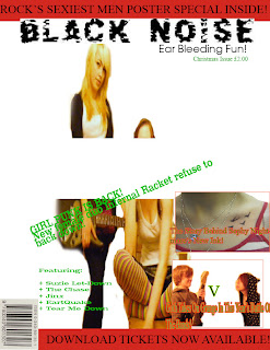
Changes Made to Magazine Front Cover
I have changed the main image and the font of the main sell line, I have also added some feautured bands in the corner. I am not sur which of these 2 layouts I would like to use but I am definately going to remove the white box that I have accidentally place over the main image!!
Wednesday, 16 February 2011
Contents pages that I like.

I like this contents page as the layout is clear and well-structured. It gives the reader a lot of information without being cluttered.

Again, this contents page has a very good structure to it, it has less picturs than the first example but still gives a clear idea what to expect from inside the magazine.
Tuesday, 15 February 2011
6th Draft of Double Page Spread. (maybe final but might change pic for better quality version)
I have added, the magazine's logo(next to the page numbers) and website, along with credits for the photographs and article for authenticity. I have also included a "mini-review" in the bottom, similar to an double page spread I found in Q magazine.
Friday, 11 February 2011
Friday, 4 February 2011
3rd Draft of Double Page Spread
Here, I have put the title in the colours of tartan and added a black box as a background. I have also put the article in red and added a yellow outline to the introductory paragraph to make it stand out.
1st Draft of Double Page Spread
I have put my article and picture but still need to think about the title and also different fonts and different colours.
Subscribe to:
Comments (Atom)


