Friday, 17 December 2010
About Deadline.
I have finished my music magazine front cover, but I can not post it to my blog as it is saved to the school computer and I was going to save it to my memory stick and post it to my blog today(Friday 17th December) but the school was closed, sorry!
Thursday, 16 December 2010
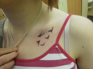
Examples of Subsidiary Image for "Rockstar's Tattoos".
Here are 3 examples of images that I could use for my subsidiary image on the theme of "Rockstar's tattoos", I wanted the image to highlight the tattoo but not show just the tattoo. For this image, I used a normal biro and drew a tattoo onto my friend Steph :) I think this idea worked well.
Examples of Main Image.
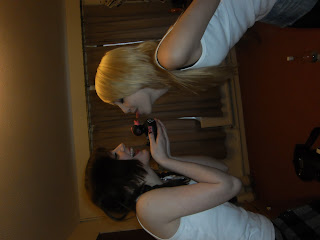
Here's a selection of 5 of the images that I could use for my main image. I have used a guitar, a rubber duck and a bottle of rum as props. I am going to remove the background and add one of two possible backgrounds.
Possible backgrounds:
Tartan -
Tuesday, 14 December 2010
Second & Third Drafts of Music Magazine Cover
Here I have added a slogan and filled in the bottom banner.
Here I have added one subsidiary image(in which I removed the background and added the letter "V"), I still have to think about, the barcode, price and date/issue number, the sell lines, the second subsidiary image and the main image.
Monday, 13 December 2010
Tuesday, 7 December 2010
Magazine Covers/Images that I like.

I like this cover, for the glance. The look in the artists' eyes makes them appear powerful and dominant, this is how I want my cover artists to appear.

This image is shot from a slightly low angle, emphasising the superiority and overall power that the band have, they almost look arrogant.

This image shows a similar stance and facial expression that I want to create for my subsidiary image on "Battle of the Bands".

This image is similar to the one that I hope to create for my subsidiary image of "Rockstar's tattoos and their meanings". It shows the detail of the tattoo beautifully.
First Draft of Music Magazine Cover (without sell lines, barcode, issue number, slogan or images)
This is the basic idea of what my music magazine will look like (with images), I have also added a note to myself too remind me to change the font of the masthead to a font that I have found on an online font generator. Here is a sample:
Thursday, 2 December 2010
Photoshoot Planning for Music Magazine.
Main Image:
Shoot date and time | Saturday 4th December 2010 |
Image Description | Medium Close Up of 2 male and 1 female model from a lower angle making them appear dominant |
Shoot Location | A room with different instruments set up to simulate a band practice |
Model / person contact Details | Kate Morgan, Rhys Jenkins and Adam Turner |
Permission Details | I have asked their permission :) |
Props | Instruments |
Plan of shots | Try different arrangements and/or angles, look at front covers containing other punk artists |
Subsidiary Image 1(battle of the bands):
Shoot date and time | Saturday 4th December 2010 |
Image Description | 2 band members facing each other, from side on |
Shoot Location | A hall that looks like it could be used for a concert |
Model / person contact Details | 2 of my friends |
Permission Details | I have asked their permission :) |
Props | maybe instrument and/or microphone, to create realism within the picture to the fact that they are from a band |
Plan of shots | Take a couple from each side, medium close up to show expression on the face (determined) but still get the props in. |
Subsidiary image 2 (Rockstar's tattoos and their meanings):
Shoot date and time | Saturday 4th December 2010 |
Image Description | A close up of a tattoo to show the detail |
Shoot Location | Anywhere available |
Model / person contact Details | Unsure (someone with tattoos :P) |
Permission Details | I will have asked their permission :) |
Props | N/A |
Plan of shots | Try different angles, make sure to get all of the detail in |
Subscribe to:
Comments (Atom)


