Friday, 17 December 2010
About Deadline.
I have finished my music magazine front cover, but I can not post it to my blog as it is saved to the school computer and I was going to save it to my memory stick and post it to my blog today(Friday 17th December) but the school was closed, sorry!
Thursday, 16 December 2010
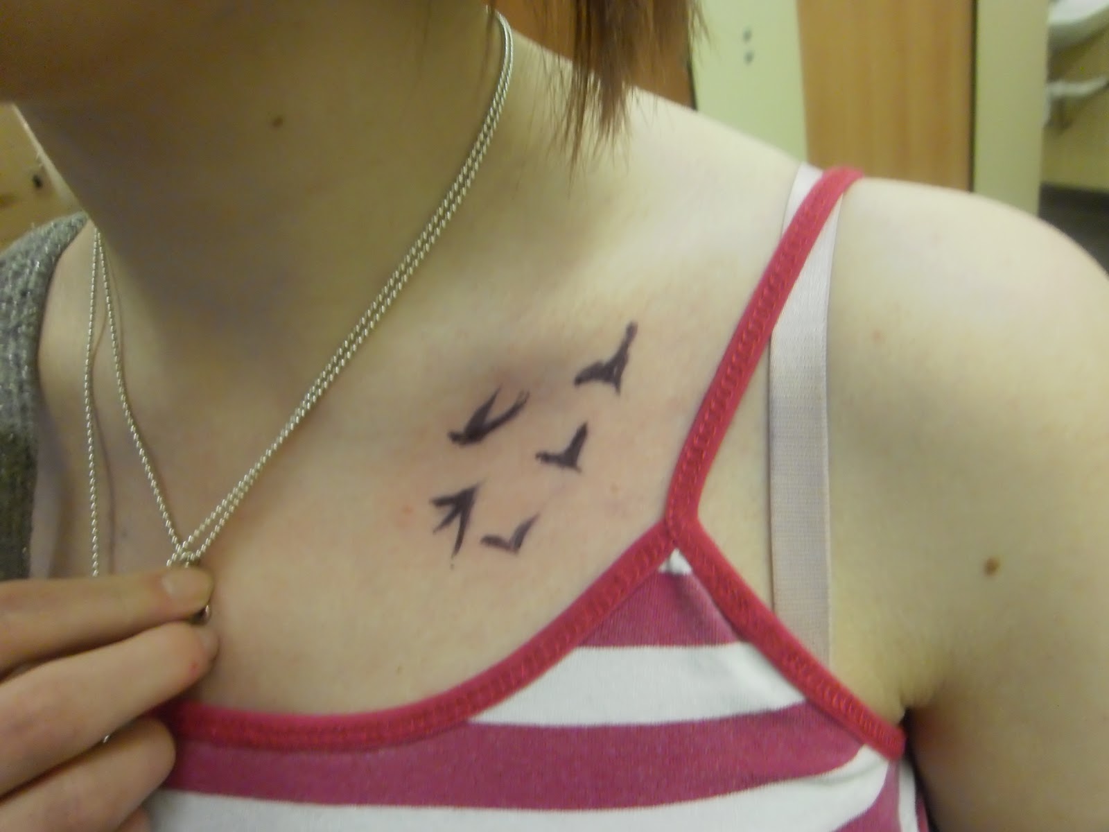
Examples of Subsidiary Image for "Rockstar's Tattoos".
Here are 3 examples of images that I could use for my subsidiary image on the theme of "Rockstar's tattoos", I wanted the image to highlight the tattoo but not show just the tattoo. For this image, I used a normal biro and drew a tattoo onto my friend Steph :) I think this idea worked well.


Examples of Main Image.
Here's a selection of 5 of the images that I could use for my main image. I have used a guitar, a rubber duck and a bottle of rum as props. I am going to remove the background and add one of two possible backgrounds.


Possible backgrounds:
Tartan -

 Brickwork -
 Tuesday, 14 December 2010
Second & Third Drafts of Music Magazine Cover

Here I have added a slogan and filled in the bottom banner.

Here I have added one subsidiary image(in which I removed the background and added the letter "V"), I still have to think about, the barcode, price and date/issue number, the sell lines, the second subsidiary image and the main image.
Monday, 13 December 2010
Tuesday, 7 December 2010
Magazine Covers/Images that I like.

I like this cover, for the glance. The look in the artists' eyes makes them appear powerful and dominant, this is how I want my cover artists to appear.

This image is shot from a slightly low angle, emphasising the superiority and overall power that the band have, they almost look arrogant.

This image shows a similar stance and facial expression that I want to create for my subsidiary image on "Battle of the Bands".

This image is similar to the one that I hope to create for my subsidiary image of "Rockstar's tattoos and their meanings". It shows the detail of the tattoo beautifully.
First Draft of Music Magazine Cover (without sell lines, barcode, issue number, slogan or images)

This is the basic idea of what my music magazine will look like (with images), I have also added a note to myself too remind me to change the font of the masthead to a font that I have found on an online font generator. Here is a sample:

Thursday, 2 December 2010
Photoshoot Planning for Music Magazine.
Main Image:
Shoot date and time | Saturday 4th December 2010 |
Image Description | Medium Close Up of 2 male and 1 female model from a lower angle making them appear dominant |
Shoot Location | A room with different instruments set up to simulate a band practice |
Model / person contact Details | Kate Morgan, Rhys Jenkins and Adam Turner |
Permission Details | I have asked their permission :) |
Props | Instruments |
Plan of shots | Try different arrangements and/or angles, look at front covers containing other punk artists |
Subsidiary Image 1(battle of the bands):
Shoot date and time | Saturday 4th December 2010 |
Image Description | 2 band members facing each other, from side on |
Shoot Location | A hall that looks like it could be used for a concert |
Model / person contact Details | 2 of my friends |
Permission Details | I have asked their permission :) |
Props | maybe instrument and/or microphone, to create realism within the picture to the fact that they are from a band |
Plan of shots | Take a couple from each side, medium close up to show expression on the face (determined) but still get the props in. |
Subsidiary image 2 (Rockstar's tattoos and their meanings):
Shoot date and time | Saturday 4th December 2010 |
Image Description | A close up of a tattoo to show the detail |
Shoot Location | Anywhere available |
Model / person contact Details | Unsure (someone with tattoos :P) |
Permission Details | I will have asked their permission :) |
Props | N/A |
Plan of shots | Try different angles, make sure to get all of the detail in |
Tuesday, 30 November 2010
Questionnaire Results Analysis
The results from my questionnaire show that the mastheads "Screaming Symphony" and "Black Noise" were equally popular with 3 votes each, so I have chosen to use "Black Noise" as I think it is more appropriate for my magazine. The preferred slogan was again a tie between two. "The Music Magazine That Grabs You by the Goolies" and "Ear Bleeding Fun!" both recieved 4 votes. Overall, people were willing to pay £2-£3 for the magazine and would want it to be monthly rather than weekly. For the main image, most people thought that a mixed group should be used. The favourite colours for the magazine were black, red and green with blue featuring often too. The stories that people would like to see most in the magazine include, "Upcoming Gigs and Tours", "Fan Art Section", "Comic Strip", "Battle of the Bands" and "Rockstar's Tattoos and Their Meanings"
Monday, 22 November 2010
Reader Profile for my Music Magazine


 Male - 55%
Female 45%
Average age - 18Still Studying - 71%
Work Full Time - 10%
In the last 12months readers have bought on average:
- 47 CD Albums
- 21 CD Singles
10% specialist record shop
53% online retailer
27 tracks downloaded in last month
33 albums burned to computer
22% own a minidisc player
30% own an iPod
29% digital radio
31% CD player
Gigs and events:
72% go to gigs regularly/often - on average 2 gigs per month
1 festival per year - 60% got tickets online
32% over phone
26% agree that "advertising helps me choose what I buy"
93% agree that "music is and important part of my life"

 87% agree that they "like to listen to knew bands"
45% are "tempted to buy products I've seen advertised"
Mission Statement for Music Magazine
Black Noise is a new kind of music magazine that combine genres such as punk, grunge and rock.
Black Noise is aimed at a younger fan base who appreciate contemporary music but also have a taste for an older generation of tracks. The age range being 15-25. Black Noise's readers should have a dark sense of humour and almost an arrogance about them.
Black Noise contains all the knowledge needed to keep up with the world of rock music. It includes an edgy attitude and adds a sarcastic bite to nearly all topics.
Black Noise will not be afraid to raise an issue when needed and will make jokes at people's expenses. It will not shy away from offending for the general outcome of humour.
Black Noise's role in it's readers' lives is to inspire, inform, prehaps even insult at times, but most of all to entertain.
Wednesday, 17 November 2010
Music Fan Profile
Punk Princess
what is she wearing? Ripped black tights, short denim/tartan skirt, huge black boots or cutesy dolly shoes, leapord print and leather. Polka dots and stripes are a must. Piercings. Safety pins and badges and anything with an innappropriate slogan. The more anti-government, the better. Brightly coloured hair stuck up at random angles or prehaps even shaved!
listening to anything with a hidden message and loud, angry vocals. Smashing noises are good too. The Clash, Towers of London, Less Than Jake, Sex Pistols, Rancid, Distillers.
wants to be Johnny Rotten's wife, or at least his "bit on the side"!
find her backstage at an underground gig, or at a political riot giving David Cameron the finger.

Monday, 15 November 2010
Kerrang! Magazine Cover

Monday, 8 November 2010
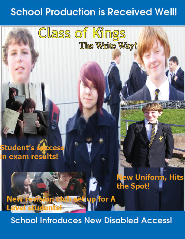
Evaluation of my Magazine Cover
The name of the magazine is appropriate. The word "class" refers to the fact that it is a school magazine and the word "kings" links into the name of the school. The colour scheme of the masthead is appropriate as it reflects the school colours. The masthead is larger than the other text used on the page, but it is not large enough to obstruct the main image.
I have used the main image as a backdrop for the magazine cover but it would not fit without being stretched, so I have used the banners to compensate. It is a lot larger than the other images I have used. My main image does not necessarily represent a certain story but it gives the idea of what pupils and school life are like at KHS. The main image is in the middle of the page, behind the masthead, slogan and subsidiary images.
My magazine cover has 3 subsidiary images. The subsidiary images are smaller than the main image, but big enough to be able to make out what is going on. I have placed the subsidiary images around the sides of the main image so as not to get in the way of the main image. The subsidiary images I have used give a clear indication of the stories they represent, as I have used suitable props that help to create a believable image.
I have used a sell line under each subsidiary image to help describe what is happening. I think they give a clear indication of what the picture is showing and what will be inside the magazine. All of the sell lines are in the same orange. I have used this colour as it could be seen wherever I placed the text against the background.
The language I have used is both informativve, as it explains what is going on, and entertaining, as I have used literary devices. The literary devices I have used include alliteration in the words "student's success" and the idiom "hits the spot".
I have used 2 different fonts, one for my masthead and slogan, and one for my sell lines. The font size of my masthead is bigger than my slogan which is in turn, bigger than the font used for my sell lines.
The layout of the font page is clear as the images are all equally visible and the sell lines are in line with the correct subsidiary images. However there is not much organisation to the page. The subsidiary images look as though they have just been placed on with no thought.
The front page of my magazine would appeal to the reader as it is easy to understand but also it is not exactly as eyecatching as I would have liked. My magazine follows most of the conventional rules of a magazine cover but it does not include a date or a barcode. It is recognisable as a school magazine as it covers school related topics.
The 3 aspects of my front cover that I think work well are the main image, the masthead and the alliteration used in one of the sell lines. The 3 aspects of my front cover that can be improved are the (lack of) issue number and date, the placement of the subsidiary images and the fonts used.
Thursday, 4 November 2010
Monday, 1 November 2010


Photoshoot Planning.
1. Shoot date and time | 1st November 2010 11:00 |
Image Description | A boy smiling in the new uniform |
Shoot Location | Outside of upper school canteen, with the grass behind. |
Model / person contact Details | - |
Permission Details | - |
Props | No props were needed. |
Plan of shots | - |
2. Shoot date and time | 1st November 2010 11:00 |
Image Description | A mixture of pupils from different key stages. |
Shoot Location | Outside of the leisure centre, using the grey wall as a blank background. |
Model / person contact Details | - |
Permission Details | - |
Props | No props were needed. |
Plan of shots | - |
3. Shoot date and time | 1st November 2010 11:30 |
Image Description | A set of sixth form pupils, acting out a scene that would take place in a revision club. |
Shoot Location | Upper school hall. |
Model / person contact Details | - |
Permission Details | - |
Props | Books, paper, pens. |
Plan of shots |
Subscribe to:
Posts (Atom)